
M. C. Escher : 1898-1972
I wasn’t even a teen when I discovered Escher in one of the many art books in my Marm’s personal library. She had shelves of books devoted to “Culture” in fields as varied as anthropology, mythology, (ancient) history, art, music … everything an always-hungry young mind would want to explore; she even preferred cookbooks that included something about the culture mixed in with the recipes. If I recall correctly, M.C. Escher was included in an anthology that celebrated artists that worked primarily in black & white—etchings, woodcuts, charcoal, etc.—in a manner that would now be recognized as “linework”. I was immediately drawn to his work because each piece invited / encouraged the viewer to go on a visual journey through the patterns, shapes, and stories that his pieces told.
He is most well known for his geometric / mathematical / pattern pieces: [list of below pieces linked]. However, even his earliest body of work shows an attention to shape, volume, and the space a subject takes that is both subtle and powerful. When experiencing his full body of work, I see a gradual refinement of what he wanted to investigate through his art. He is the very definition of an Archivist; I hope I am able to maintain the level of curiosity that he did in his life.
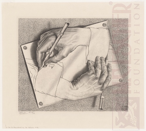
“Drawing Hands” : 1948
This lithograph is from mid-career when Escher had returned to the Netherlands—after having spent quite some time primarily in Switzerland and Italy. Even in the midst of creating his collection Impossible Constructions, he would often return to less mathematical / geometric subjects: landscapes, figures, wildlife, etc. Throughout his career, he always worked to integrate his fascination with mathematics, love of problem-solving, and being wonderstruck by the natural world into his pieces. His son, when being interviewed for a university project by my husband, expressed that Escher “was continually inspired by his foundation in mathematics and architecture” (paraphrased).
I find myself also drawing on seemingly opposing influences—logic v emotion—in my own work. I must admit that the challenge of translating my own journey through disability into landscapes is both exhilarating and provokes anxiety.

“Relativity” : 1953
This is one of Escher’s many Impossible works that I can get lost in for hours. The more time I spend trying to ‘walk’ each staircase, the more often I have to stop and investigate a door, window, or landing for another staircase. Each one invites me to create stories for the persons that I meet on my travels; each one seems to lead to a different ‘world’ contained within the greater one.
It’s this sense of wonder, playfulness, and invitation to explore that I find so captivating in Escher’s body of work. I consider my own work to be ‘successful’ when I’ve managed to do the same.

“Self Portrait in a Chair” : 1920
Much of Escher’s early work was crafted through woodcuts, ‘simple’ pen-ink drawings, and (what we now refer to as) ‘stamp’ application. I learned many of the basic techniques in my own university studio work. The process is fairly simple:
make a finished sketch of the desired image on any surface that can be carved
remove (through carving) those areas that you don’t want to be inked
apply ink to the uncarved areas — generally with an tool called a brayer
transfer the desired image to paper by stamping or using a press
The very simplified difference between this general process and etching is that this is a “relief” technique while etching (and others) is a “recess” one. The former applies ink to raised areas while the latter applies it to engraved / valley areas. Each general technique has its pros and cons. Relief techniques rely on leaving untouched those areas that you want to show in your piece; the problem is that if you accidently carve something you want to appear, there is no easy way to replace the removed material. It is also much more difficult to convey mid-shades of black / white (greys), which tends to produce very graphic two-toned pieces. I can’t count the number of relief prints I’ve had to do over again because it was easier to start fresh than to try and ‘glue’ missing material back in.
On the other hand, recess techniques (where the ink lies in the grooves) tend to require many test iterations of the final piece, where each trial reflects small changes that have been made. It can take—and often does—much longer to produce a recess print because of this iterative process. One of the benefits of small, incremental changes is that one can fool the eye of the viewer into seeing those grey shades that are often missing in relief pieces: cross-hatching, stippling, half-tone dots, etc.
I’ve studied, and used, both techniques in a variety of ways over the years to varied success. As both require specific tools and equipment, they also tend to occupy a large space in any studio. In the end, I tend to rely on a third method of pen / ink drawing to achieve similar results. The benefit is that one only needs paper, ink, and some way to apply it; the drawbacks are the time involved and each piece is a one-off (rather than the duplication available in the other printing techniques).
More specific to this piece, I am constantly captivated by Escher’s use of large shapes to anchor the viewer: the triangle of the right (viewer) leg, the large rectangle of the chair, the disappearing perspective triangle produced by the background images. He’s also used the inherent lack of mid-tone greys to emphasize these shapes. I can feel the pain in my own hips and legs were I to try sitting like that.